Conversation
|
✔️ Deploy Preview for stackbit-components ready! 🔨 Explore the source changes: 4363b82 🔍 Inspect the deploy log: https://app.netlify.com/sites/stackbit-components/deploys/6197f10d001e900007f8d369 😎 Browse the preview: https://deploy-preview-57--stackbit-components.netlify.app |
| @@ -0,0 +1,121 @@ | |||
| type: object | |||
| name: FeaturedItem | |||
There was a problem hiding this comment.
Following the naming pattern, you should name the section FeaturedItemsSection.
| - type: string | ||
| name: title | ||
| label: Title | ||
| default: Item |
There was a problem hiding this comment.
This is the field for the section title, not the item title, and in most cases the section will consist of more than one item. Please change the default value to something else, it could be "Reviews" or other.
| - type: string | ||
| name: subtitle | ||
| label: Subtitle | ||
| default: Featured blog posts section example |
There was a problem hiding this comment.
Please change the default value.
| borderColor: | ||
| - value: 'border-primary' | ||
| label: 'Primary color' | ||
| styleObjectColor: 'primary' | ||
| - value: 'border-secondary' | ||
| label: 'Secondary color' | ||
| styleObjectColor: 'secondary' | ||
| - value: 'border-neutral' | ||
| label: 'Neutral color' | ||
| styleObjectColor: 'neutral' | ||
| - value: 'border-complementary' | ||
| label: 'Complementary color' | ||
| styleObjectColor: 'complementary' | ||
| - value: 'border-complementary-alt' | ||
| label: 'Complementary alt color' | ||
| styleObjectColor: 'complementaryAlt' |
There was a problem hiding this comment.
styleObjectColor was removed use this link as example how to update the values ->
 leibole
force-pushed
the
item-component
branch
from
leibole
force-pushed
the
item-component
branch
from
9e722b5 to
9eff6ff
Compare
|
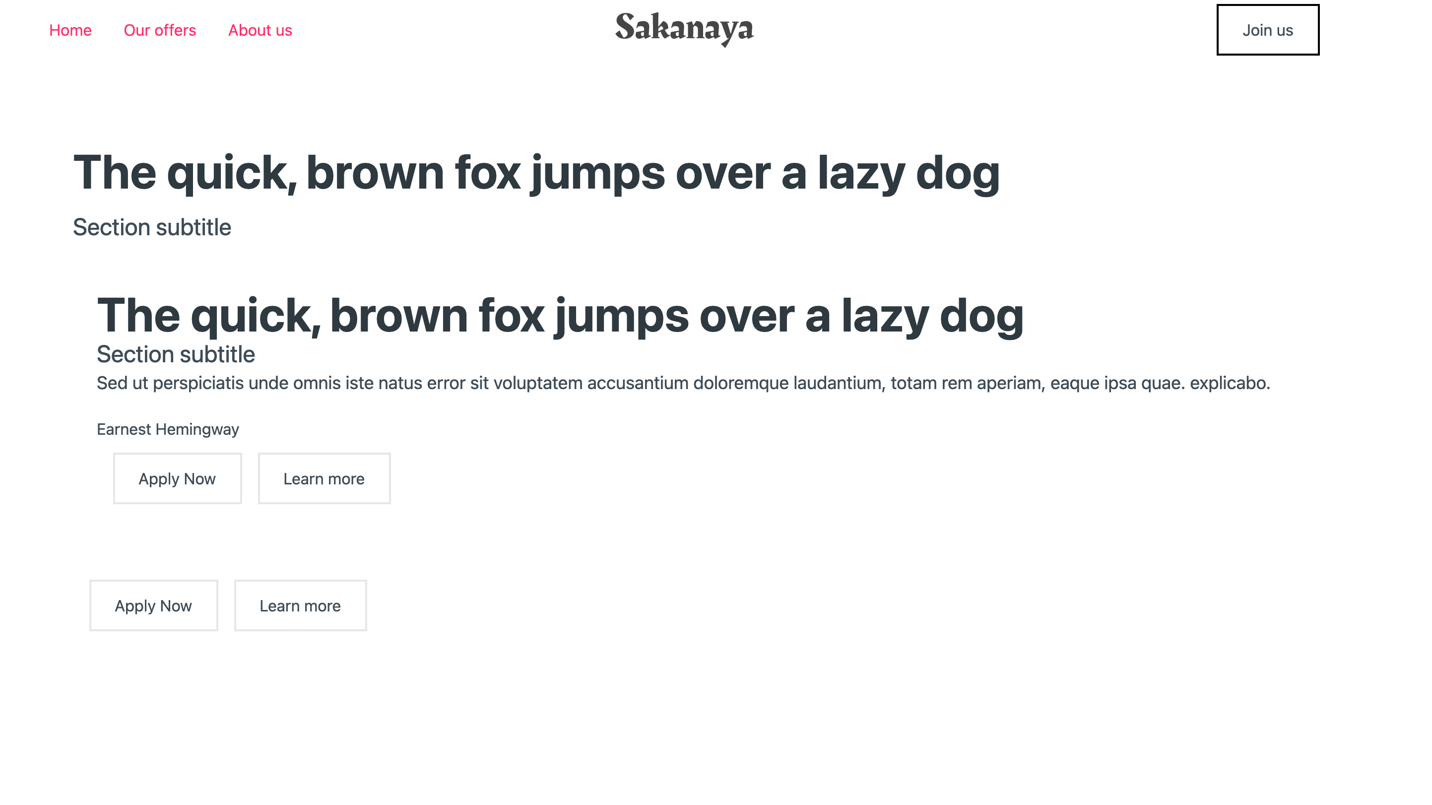
@leibole Hey a few things to make this process easier for me to review.
I tested the component. It does not look like the components design is finished. I've attached a screenshot:
Note: I added the
|
| @@ -0,0 +1,115 @@ | |||
| import * as React from 'react'; | |||
|
|
|||
There was a problem hiding this comment.
nit: no need for line breaks between these imports
|
|
||
| export default function FeaturedItemsSection(props) { | ||
| const sectionStyles = props.styles?.self || {}; | ||
|
|
There was a problem hiding this comment.
Most other components declare cssId and colors variables here.
 const cssId = props.elementId || null;
 const colors = props.colors || 'colors-a';
You will need the cssId, which should be added as the id of the components main
Not sure if you need the colors. @TomasBankauskas What's the go here, are all components supposed to work with colors?
|
|
||
| const sectionBorderWidth = sectionStyles.borderWidth ? sectionStyles.borderWidth : 0; | ||
| return ( | ||
| <div |
| return ( | ||
| <div | ||
| className={classNames( | ||
| 'sb-component', |
There was a problem hiding this comment.
All components should have the following classes following specific naming conventions
'sb-component',
'sb-component-section', (if the component is a section, alternatively it can be sb-component-layout or sb-component-block)
'sb-component-featured-items-section' (based on components name ie FeaturedItemsSection)
| }} | ||
| data-sb-field-path={props.annotationPrefix} | ||
| > | ||
| <div |
There was a problem hiding this comment.
I wont comment on the main component until the design is finished. I tried a few of the different options in the Studio like changing the alignment and justify and they did not seem to align properly.
| label: Get Started | ||
| url: '/' | ||
| style: primary | ||
| elementId: hero-main-button |
| label: Get Started | ||
| url: '/' | ||
| style: primary | ||
| elementId: hero-main-button |
| - name: settings | ||
| label: Settings | ||
| fields: | ||
| - type: string |
There was a problem hiding this comment.
I think it's inherited from the section yaml.
There was a problem hiding this comment.
Yes I think you are right. No need to add it then.
| const sectionBorderWidth = sectionStyles.borderWidth ? sectionStyles.borderWidth : 0; | ||
| return ( | ||
| <div | ||
| className={classNames( |
There was a problem hiding this comment.
missing elementId and classes. I commented on this in more detail on the FeaturedItemSection component
| const Template = (args) => <Item {...args} />; | ||
|
|
||
| const args = { | ||
| type: 'Item', |
There was a problem hiding this comment.
args should use the same values as the model default values
|
@JugglerX These are the notion docs: As you can see in the notion docs, there's still no design for these, which is why I implemented something very basic. |
leibole
force-pushed
the
item-component
branch
from
6d01f91 to
4449fb3
Compare
3 participants
No description provided.